Dauphin Pastoureau
上海奥纳森
2022-02-03
Dauphin Pastoureau
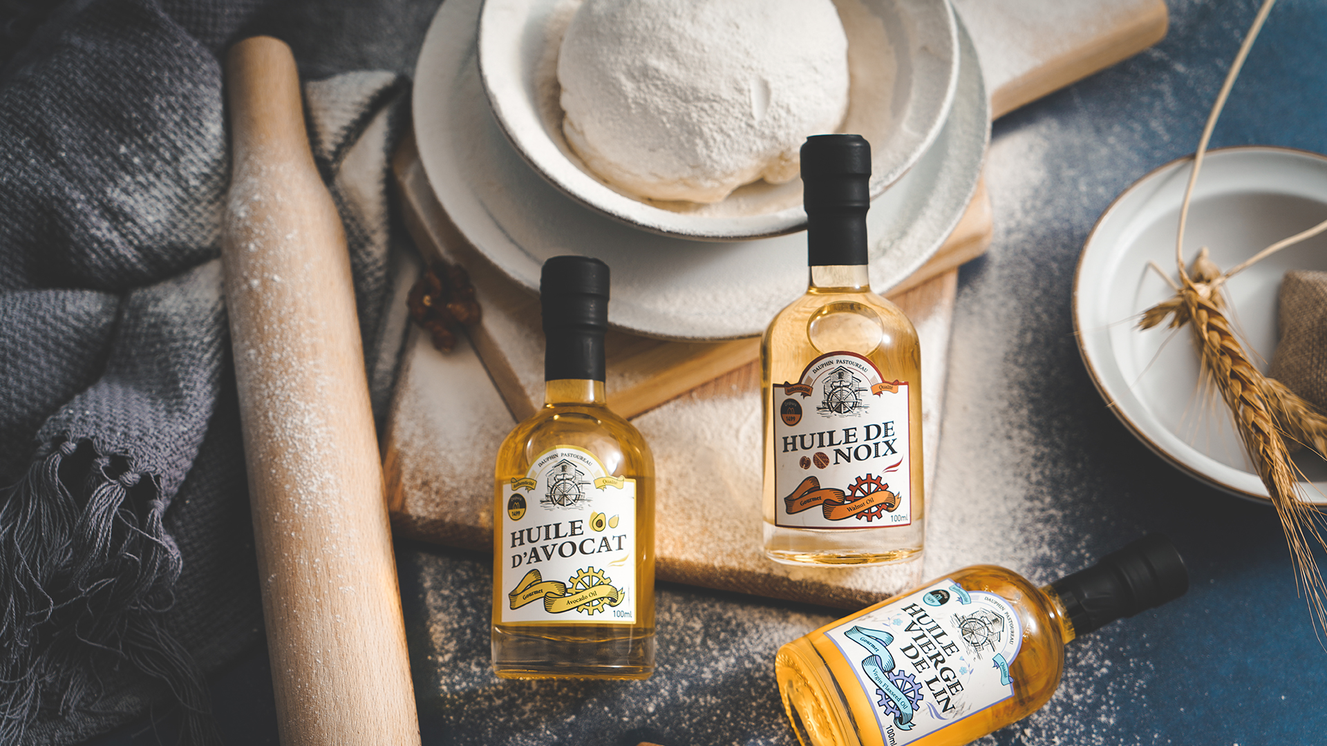
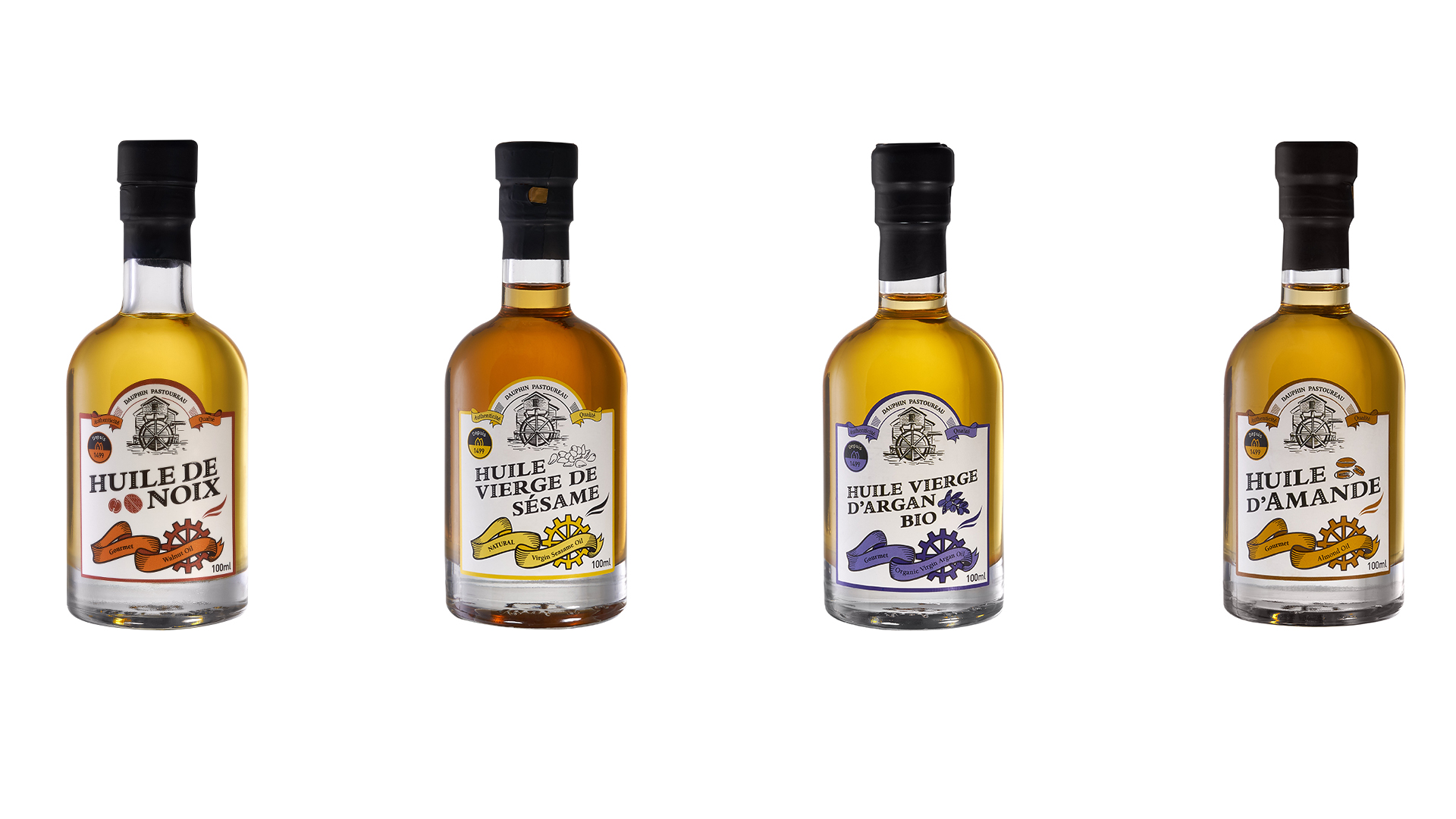
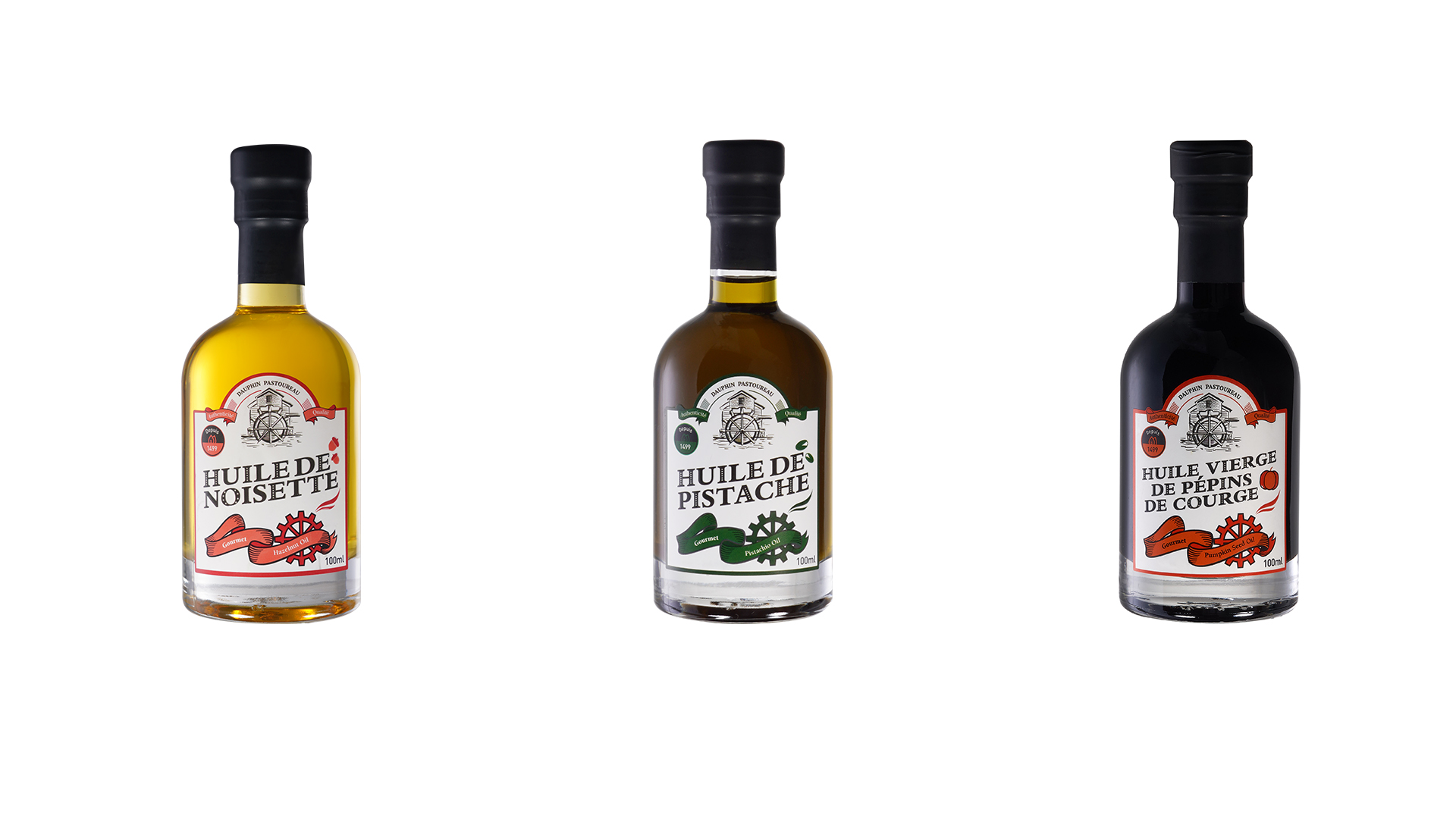
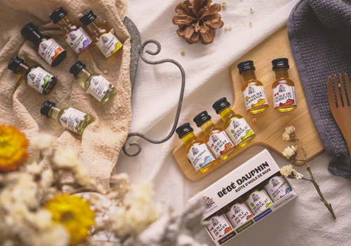
The packaging concept for the Dauphin Pastoureau nut oil establishes a close connection to its production area of Périgord, an region of France. Dauphin Pastoureau guides users to focus on the label on the bottle: to enhance product recognition, the name of the nut is placed in the most salient part on the label, and a recognizable simplified nut pattern is added. The combination of text and icons helps users better distinguish between different types of nut oils. On the bottle, there is a logo of Dauphin Pastoureau and a graphic of waterwheel and mill designed to trace the origin of Dauphin Pastoureau-Mounlin Martin. Additionally, the number “1499” on the left round icon marks the founding time of Dauphin Pastoureau, conveying its philosophy that centers on the quality of more than 500 years. Moreover, the black rubber cap wrapping the bottleneck ensures its airtightness. The bottle made of transparent glass can be seen through and adheres to the environmental protection concept. According to the nutritional compositions of different nuts and applicable scenarios, 7 different nut oils that better meet the nutritional needs of the human body are contained in a set. This set encompasses two kinds, namely family pack and portable pack, from which users can choose according to their needs. Dauphin Pastoureau, by product packaging, expresses the brand's heritage of respecting nature and following traditional concepts.
获奖链接: