伯珍系列酒包装
北京京东世纪信息技术有限公司
2022-02-03
伯珍系列酒包装

Liquor, as for many Chinese, bears the meaning of inheriting and developing Chinese liquor culture in addition to its taste and texture. BOZHEN series, taking Chinese liquor culture and classic architecture art as cores, aim to arouse people’s recognition of them, and lead the national culture to the world by virtue of the liquor bottle.
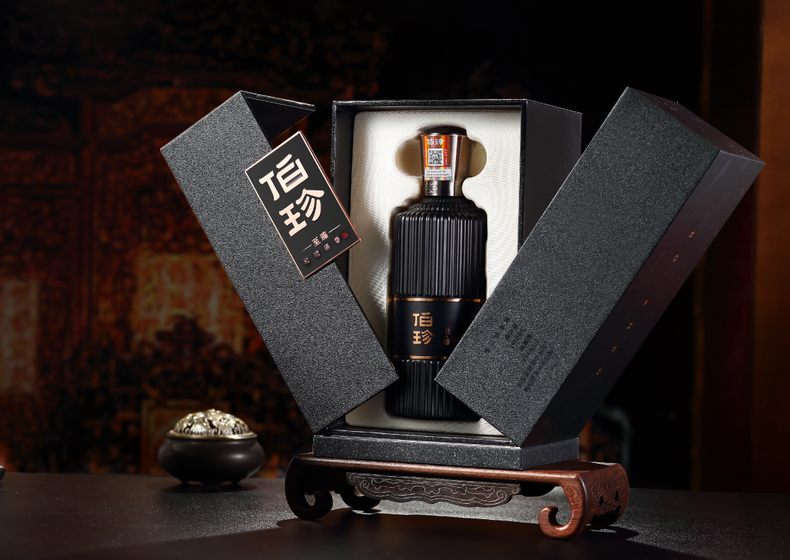
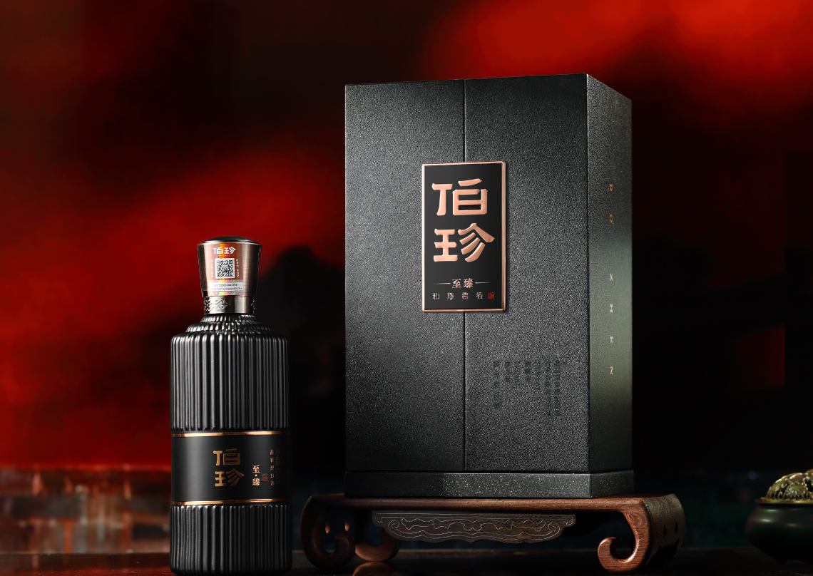
The design team incorporates modern aesthetics and classic architecture into the body, and adorns the bottle with fluent vertical textures which reminds people of the elegance and majesty of traditional Chinese architecture. The texture also helps users unscrew the caps. Moreover, the script on the middle of the bottle, with a powerful and structured touch, is laid out as the traditional Chinese calligraphy does, adhering to the product’s tonality of calmness and simplicity. However, there is still some blank space on the bottle that, besides rendering it more layers, piques users’ interest in exploring the product.
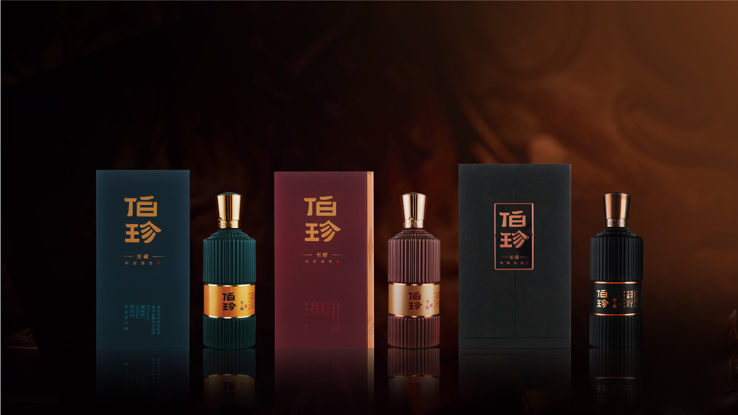
The design team selects the mineral pigments in the traditional Chinese painting, namely malachite green, ochre brown and obsidian black as the main colors of the bottle and its outer packaging to match the years of brewing for intuitive differentiation. While the three varied box-shaped structures better help users experience the unique sacredness of Chinese liquor culture during opening and boost their collection values and gift-giving tastes. The bottleneck is adorned by four auspicious clouds that are both wonderful wishes for people and signs for four seasons, standing for the craftsmanship in the brewing that adheres to nature and four seasons.
获奖链接: